Analyzing PBE 2024 Judging Data

We’re getting in the weeds with display talk here with traditional vs contemporary, seasonal representation, wood types etc. Really the fundamentals were lost on a few displays. Danny and TJ and I got to talking about this at one point. Some of the Japanese “rules” can be obtuse, but the reasoning behind most of them is basic composition theory.

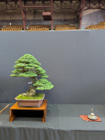
The main elements of a display that need to be right are a stand at the proper size for tree, and that raises the tree to the appropriate eye line for the viewer. An accent that interacts with the tree in a way that moves the viewers eye in a circle to keep them engaged in the composition. And a stand or slab for the accent that works well. And of course pots (or slabs/stones,) for both that complement the tree and each other. Traditional vs non traditional, I don't really care, as long as it works.

A cup of olives doesn't work. Two trees pointing the same direction and leading your eye out of the composition doesn't work. A tree with a stand/slab that’s too low doesn't work, like on that big Ponderosa.

Start nailing the basics of composition, then start talking about fall representation, wood types etc.
Well put.

Not sure how it was missed but I guess Todd assumed his table height would be 30”, not the much lower table it was ultimately shown on.
 
Last edited:
I don't think the cup of olives is super detrimental, they are thematic, seasonal, placed right, etc. I do agree that they are bit "on the nose", maybe not the most innovative, but hard for me to say they don't work. Since you guys had such strong opinions about the others, how do you feel about these displays/accent pieces:

Bridge:
1731028970140.png

Hanging Orchid:
1731028985628.png

Bell(?):
1731029126956.png

@yenling83's Ewok:
1731029617952.png
 
I feel like for those engaged in other artistic pursuits, easily identifying obvious aeathetic discrepencies is easy. Part of the aspect on display that I appreciate is the purposeful mininalism that is necessary to highlight the fine details. Thats why the messy overcrowded table doesnt look right. The best displays seem to have a lot of space to focus on detail.

Directionality, for me, should highlight weightiness or flow or repeating lines... much like rhythmic ideas in a song, or brush strokes in a painting. I look for either parallel or perpendicular directionality. A display with perpendicular angles is tense and aggressive. A display with parallel lines, peaceful.

BTW, great info and thread @NaoTK
 
Regarding the olives...
1. A plate of olives - too obvious/novice
2. A bottle of olive oil - Kitsch
3. Plastic / toy olives - ???
4. 3 olives, perhaps with one halved and arranged so that the olive's straight line matches the directionality of the tree, olive color chosen to compliment or contrast the pot of the primary tree - a well done purposeful display
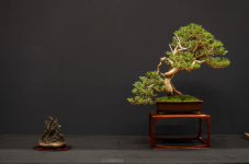
Fun fact: To remove the bitterness of olives, you rinse them for weeks in a stream. A sprinkling of river rocks or a freshwater animal figure would have been nice.
 

While both of these trees have canopies offset to the left, that is just to be a visual balance to the extreme "weight" that the key branch gives by pointing so strongly to the right.
The same is true for the rocky juniper in the composition below, just in the opposite directions. Strong left key branch is balanced by a crown to the right.
These all would be considered "leaning" trees. With them, the key branch tells the direction of flow. The offset crown, however, is critical to make sure the tree does not look unstable and about to fall over. The hemlock has a subtle lean while the Rocky is strongly leaning.
Both the Rocky and the Hemlock came out of Michael Hagedorn's yard (both client trees).

1731046375938.png
 
Well put.

Not sure how it was missed but I guess Todd assumed his table height would be 30”, not the much lower table it was ultimately shown on.

Todd came to NVBS for a demo last weekend and said exactly this. He didn't realize the XL tables were shorter than the others, though he didn't seem super bothered by the height difference.
 
That tree has a split personality, it seems to point both ways. I would have liked the accent on the other side of the Sierra that Nao posted earlier. There were several trees like that.
The thing that bothers me the most about this tree (besides the left branch) is that it looks like it was given a new planting angle but the foliage wasn't rewired for the angle change.
 
I don't think the cup of olives is super detrimental, they are thematic, seasonal, placed right, etc. I do agree that they are bit "on the nose", maybe not the most innovative, but hard for me to say they don't work. Since you guys had such strong opinions about the others, how do you feel about these displays/accent pieces:

Bridge:

Hanging Orchid:

Bell(?):

@yenling83's Ewok:

Bridge: Definitely a bit kitschy and maximalist. I think I'd have liked it a bit more if it was executed a smidge better. The bridge was built nicely but I'd have liked to see it rise up and down like a typical bridge in a Japanese garden
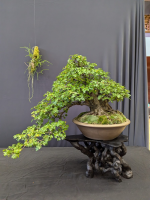
Hanging orchid: I thought the root stand was a bigger issue than the orchid. No idea if the orchid is from the same environment as the tree
Bell: Eh...
Ewok:
1731082584715.png
 
Todd came to NVBS for a demo last weekend and said exactly this. He didn't realize the XL tables were shorter than the others, though he didn't seem super bothered by the height difference.
That makes sense. Todd knows what he’s doing. Too bad he got caught off guard though.
 
I try to think of the display as small hints to what environment I invision my tree growing in. The tree is in a pot isolated from its environment so the story of where it has been growing all these years to look the way it does has to be implied. Like any good monster movie we need to give the observer space to use their own imagination. Their mind will always make something more suspenseful or emotional. Give your viewer a glimpse of a fin don't show them the whole shark.

This is why less is more when it comes to bonsai displays. If your tree looks like it's hanging off the edge of a cliff then you place an iris as your accent plant your viewer gets the wrong signal that you think this is growing in a high moisture lowland or next to a stream. We can't always put our finger on why something is off because some of this knowledge of plant habitats is subconscious for many humans as it's no longer required info for finding and gathering food.

If you see your tree growing in an open field show me grasses and forbs if it's a forest planting show me ferns and forest ephemerals if it's a mountain tree show me rocks and lichen then let the viewer fill in the negative space with their own imagination.
 
More analysis by request

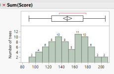
Here is the number of trees in the exhibit by total score. It's like there are two distinct groups of trees: good and not as good.
1731084064437.png

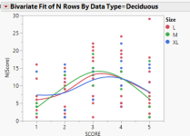
Deciduous trees shown without leaves did significantly better than trees with leaves.
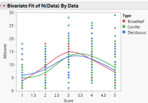
N(score) is number of judges who gave that particular score. Each point is a tree
1731085214817.png

XL conifers did much better
1731085168938.png

...but for deciduous size did not matter. I suspect because it is easy to grow a big crappy deciduous.
1731085102470.png

Native trees to North American and non native made no difference. Perhaps more bad 1 trees for natives is significant. It may mean we are rushing to show or get native trees that are not ready
1731085303103.png

Type of tree did not make a difference
1731085908736.png
 
Last edited:
Super fascinating info, thanks Nao!

Curious how many Tokutake and Sansokuu pots there were in the Exhibit? I'd bet all my money that this number will continue to grow as we have more and more Expos.
 
I don't think the cup of olives is super detrimental, they are thematic, seasonal, placed right, etc. I do agree that they are bit "on the nose", maybe not the most innovative, but hard for me to say they don't work. Since you guys had such strong opinions about the others, how do you feel about these displays/accent pieces:

Bridge:
View attachment 573617

Hanging Orchid:
View attachment 573618

Bell(?):
View attachment 573619

@yenling83's Ewok:
View attachment 573620
Did not like the bridge. Ok concept, poor execution. The bell is fine I guess, but I’d need to read the book to know why the bell works or not. Hanging a plant seems like a cool concept, but does this or his fit the overall display? I don’t know if it does.

The Ewok works for me. It is def quitche, but when that is not the focal point and in fact unknown that it’s there unless you look, makes it a very cool addition. When the overall display works so well as a whole, little Easter eggs like that push it over the top. I had no idea there was an Ewok till my 6th or 7th pass of the room.
 
Back
Top Bottom