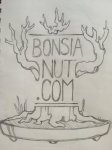
Bonsai Nut T-Shirts!

If he didn't trademark it, maybe a t-shirt with Marco Invernizzi's "Net Bonsai Wanker" on it?
 
Our club T-shirts have a large logo on the front. I prefer just a small logo or name on the front (upper left, over the heart) and a graphic and perhaps website and "theme catch phrase" on the back.

In this case maybe something recognizing the Anniversary of the forum.

Just curious, has anyone submitted any actual designs or mock-ups?
 

Attachments

  • 20160221_130956.jpg
    20160221_130956.jpg
    232.7 KB · Views: 29
is there a limit on the number of colors you want or even just a single color print? screen printed?
 
I made a few rough drawings:


IMG_0099.JPG

IMG_0098.JPG


IMG_0100.JPG

These were the best three. They are sorta in order of thought. I thought a simple clean design would be most liked, along with the font. The design is almost two denominational so you can print it real big front or back in one or as many colors as you want and have it read from up close or far away. Sorta like a tattoo. You could fill it with for soft or even aged look or stick with bright colors have a bold graphic T.

I have some major dislike one the top one but I wanted to keep the bare branches in the design and the font. Also I had toyed with making it look more "in training" but it was starting to look busy so I removed it but I thought a tree in training might be a well liked enough idea that I could return to it later.

By the time I got to the second one I was looking up users because people had mentioned that it should be a drawing of a users tree. For now I'm using trees No. 01 and 04 from this link http://www.m5bonsaiworks.com/flowering-fruiting for the last two drafts. This drawing is suppose to be similar in style to the crab apple and was suppose to have an apple for every year but I'm pretty sure there are 11 there. Not Crazy about where I put the text.

The last one I was sorta trying to put together some of the ideas I liked. It's still too simple but i was running out of ideas without feedback. I can do more if people like it.


TL;DR version:

2D Graphic desgin
Simple, easy to read
printed large
black or color
 
S
I made a few rough drawings:


View attachment 119827

View attachment 119828


View attachment 119829

These were the best three. They are sorta in order of thought. I thought a simple clean design would be most liked, along with the font. The design is almost two denominational so you can print it real big front or back in one or as many colors as you want and have it read from up close or far away. Sorta like a tattoo. You could fill it with for soft or even aged look or stick with bright colors have a bold graphic T.

I have some major dislike one the top one but I wanted to keep the bare branches in the design and the font. Also I had toyed with making it look more "in training" but it was starting to look busy so I removed it but I thought a tree in training might be a well liked enough idea that I could return to it later.

By the time I got to the second one I was looking up users because people had mentioned that it should be a drawing of a users tree. For now I'm using trees No. 01 and 04 from this link http://www.m5bonsaiworks.com/flowering-fruiting for the last two drafts. This drawing is suppose to be similar in style to the crab apple and was suppose to have an apple for every year but I'm pretty sure there are 11 there. Not Crazy about where I put the text.

The last one I was sorta trying to put together some of the ideas I liked. It's still too simple but i was running out of ideas without feedback. I can do more if people like it.


TL;DR version:

2D Graphic desgin
Simple, easy to read
printed large
black or color
Spelled it wrong! Lol
 
Back
Top Bottom