Manicured, loose, or in between

bwaynef

Masterpiece
Messages
2,184
Reaction score
2,756
Location
Clemson SC
USDA Zone
8a
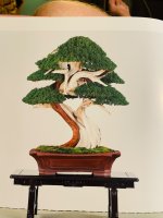
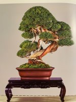
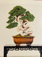
I was perusing a recent Kokufu album (96) and was struck by how differently some junipers were styled. There’s definitely a spectrum but to me these three stood out as examples of the level of control the artist exercised over the given tree.

I have my own thoughts about these styles but wanted to put it to the community for comment.

Do you like one better than another? Do you think one style requires more of something than another? What is that something? Why do you think each style exists? Have you seen YOUR personal style evolve toward either end (or the middle?) of the spectrum?
 

Attachments

  • IMG_3317.jpeg
    IMG_3317.jpeg
    244.6 KB · Views: 289
  • IMG_3318.jpeg
    IMG_3318.jpeg
    359.7 KB · Views: 285
  • IMG_3319.jpeg
    IMG_3319.jpeg
    262.5 KB · Views: 278
1 is too conventional, perfect; it almost feels like a wax sculpture. 3 is more dynamic, but my reaction is mostly an appreciative 'that's some nice deadwood.'

my eye lingers on 2 the longest. I'm both drawn to and slightly repulsed by it. At first glance the pom-pom style threw me off, but then I look closer and the placement of the tertiary branches that almost nestle the main trunk sucks me in. Usually these branches 'frame' the main line, but this design has a nuance I can't quite put my finger on. The absurdly large apical dome that the main trunk line vanishes into also evokes a 'head in the clouds.' Its figure leans forward without clear effort. The lowest hanging branch reminds me of a resting place up a long flight of stairs.

Though I think I aesthetically prefer 3, 2 makes me stop and ask 'why?' It is in my opinion the most thoughtful bonsai of the 3, with 'savor' that the other two lack.
 
WEI, that's an interesting take. Thanks for pontificating with me. It interesting that 2 repulsed you somewhat. I had that same feeling, but not with that tree. #2 stopped me in my tracks. I'd similarly stopped for #1 when I was flipping through, but for different reasons.

I'd love to hear others' opinions. Does anyone have any examples of similar stylings in other species?
 
I like it loose, always. To me it looks much more like a miniature tree. BUT I completely understand the "art of bonsai" and creating a naturalistic miniature are two different goals depending on dogma/definitions
 
1 is to constrained. Almost if you asked AI to create a "bonsai".
2 (though I love the poetic description WEI) is too over grown.
3 is by far my personal aesthetic. and that deadwood... i can get lost for hours. I want to see more of the live line, but I think that's also kinda the point.
As far as pad design aesthetic goes, I prefer shaped but not overly meticulous. I want to see that they are living trees, and not just sculpture.
 
The pot on the 1st is ok.
I don't like the abrupt rectangle atop the trunk that the foliage makes.
Looks very, cut and paste triangles.

The pot on the 2nd one has sweet lines but needs different feet.
The pot is perhaps under the wrong tree. The tree would appear older
in an older looking pot I think?

Don't care for the 3rd pot and the deadwood is distracting, gnarly as it is,
I just don't get harmony vibes here.

Conclude the 2nd one. Needs more definition in the right side pads
and separation from branch and trunk on the lower left.
All are better than mine, and I could not afford any of them.
But that helmet! Ugh
This one does hold foliage lower than all, so that is a plus for me.
I could always chop the helmet down LOL.
 
1 is fine but not especially interesting (I mean it's way better than anything I've got, but I'm trying to judge art here), it's sort of restrained, everything is within the borders of the pot (if you imagine the pot as a cylinder reaching straight up)

2 is my favorite, I like the foliage pads at multiple heights and the curves of the live vein, and the way the tree leans in to the left side, the downsweep of the branch has a welcoming feeling, like the tree is bowing. 2 feels the most organic, in a way, I mean it's very obviously been skillfully trained for a long time to get there, but it still looks like an idealized tree someone could find in nature. One thing I do not like about number 2 is the long jin branch. I often feel jin are too long, dead wood doesn't last like that in nature, it gets brittle and snaps off and leaves a jagged little stump of a branch.

3 is certainly interesting but I think it goes a little too far, it's become something abstract as that point, it's more sculpture than bonsai, it's too busy. I think I would like 3 more if the live vein showed more, if it wrapped around like it does in 2. As it is now, you mostly just see a lot of white dead wood with a few spots of green around it
 
All three are amazing works of art and I fully appreciate them for what they are, but I personally would not care to own any of them. I am not being contentious, but they all look artificial and would be completely out of place in my collection. Again, I appreciate them fully, but #1 is a big no and does look like AI as has been suggested. #2 is my favorite of the lot but still a bit too 'green' and out of balance to my eye. #3 has amazing deadwood that I find a distraction in this case.
 
To my eye, all of the foliage on these trees are extremely manicured and tight...there is nothing loose about any of them. The variation comes from the extent the deadwood is exposed/incorporated with the foliage. Number 3 is the typical green helmeted deadwood tree...very little interaction between the foliage and the deadwood...I like this one the least. Number 1 mixes the foliage and deadwood pretty well but the overly styled pads are a turnoff...Dr.Seuss style! Number 2 focuses more on the foliage and less on the deadwood but the broccoli-like overly dense pads are a big distraction. Number 2 with a 50-60% reduction and opening up of the foliage pads is really the only one of the three that has any appeal to me.
 
I don't come from an art background so sometimes its difficult for me to engage in these sorts of conversations. @johng I think what you called "overly styled" is what I was referring to as "manicured" in reference to #1. When you used "manicured", ...are you talking about foliage density? With junipers, deadwood plays a pretty important part, but I was more interested in how the foliage was treated when I created this thread.

Thanks to all who've taken the time to give your thoughts.

What do you think drives the decision on how foliage is treated? Something in the artist? The customer? The material?

Again, any examples outside of Juniper? I can think of one example, though its not exactly apples-to-apples and I don't have pictures handy right now.
 
@johng I think what you called "overly styled" is what I was referring to as "manicured" in reference to #1.
Overly styled for me refers to the pads with completely flat bottoms...very abstract and unnatural to me... manicured and tight refers to the density and the perfect silhouettes of the upper edges of the pads...
 
I find all of them attractive in different ways.

#1 is my favorite esthetic, but it's too styled. The pot is beautiful, and the graceful and elegant curve of the trunk with simple, yet tasteful interplay with live veins and deadwood is very appealing. I like the symmetry and balance of the tree. My only problem with it is that the pads are too perfectly trimmed to appear in any way natural. There is also a distracting flat cut where the uppermost section of trunk disappears into the upper foliage in the dead center of the tree.

#2 is my second favorite. Like the first one in that the pot suits the style, the graceful lines of the deadwood are not overly distracting, and I like the twisted effect of the trunk. It's definitely a looser, less confined design, which is attractive in its own way. My only flaws with this tree are that the helmet at the top is a little too much, and the pads could use a little bit more refinement and not be so round in shape.It could also stand some additional definition in the upper right.

#3 How do I put this tactfully... It has some good features, don't get me wrong, but it's hard to see them because the photo is way overexposed. The pot suits it, and there is enough separation of the pads to create visual interest. The ratio of deadwood to live is way off, and there are sections of reverse taper. The whole tree seems to be overly focused on a caricature-level tangle of deadwood. The foliage is almost an afterthought, and it's placed too high on the tree for my taste. For my eye, the tree needs to be tilted 10 to 15 degrees to the right. The pads need to be oriented with the ground.

It should be said though that I am a noob, and unworthy of critiquing these works of art. My taste is certainly not refined enough. The monstrosities I create on my own are a testament to that.
 
FYI: #2 was one of the Kokufu award winners that year, so it was seen as one of the best bonsai in Japan that year. As for #3 being overexposed, I brightened it when I took the picture (of the picture) ...hoping to focus discussion on the foliage instead of the deadwood.
 
Love the deadwood on 3, but I like a more natural look to the foliage. I don't particularly like the foliage to look like a perfectly groomed hedge. Not to disparage the artists in any way, but it just looks unnatural/artificial to me. Although there are some exceptions in nature.

broccoli-florets.jpg
 
FYI: #2 was one of the Kokufu award winners that year, so it was seen as one of the best bonsai in Japan that year. As for #3 being overexposed, I brightened it when I took the picture (of the picture) ...hoping to focus discussion on the foliage instead of the deadwood.
The foliage on #3 is unremarkable. The tree was crafted around gnarled deadwood tangles.

Overall, if I were to have my choice of one, its #1 all the way. A few weeks of growth would take care on the too-straight and too-perfect pads, as they were my only nitpicks about the tree.
 
I KNEW I recognized #2.
 
All those trees are beyond my skill level at the moment. I will say something when I get there.
 
Do you think one style requires more of something than another? What is that something?
Personally, I prefer to see "the birds fly through" and some clear but subtle variation in branch length and pad shape throughout the design. What one could describe as a looser perspective. For many of these top show trees it comes down to when they are displayed and the " condition" of the design.
Apologies for the poor photo. This tree illustrates my preference, taken during Kokufu 2024. The lighting in the hall throws lots of shadows.IMG_2505.jpeg
 
They all break one of my rules, and that is the tree shouldn't show the obvious hand of man. No way any of them look like a natural part of the landscape. Works of art....all of them. Natural? No. I'd have to pick #3 to own, but I would let it grow out and prune some spaces into the foliage.
 
Back
Top Bottom