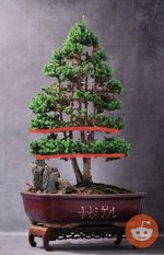
Help improving this design......

Fidur

Chumono
Messages
827
Reaction score
3,958
Location
Canary Islands , Spain. Europe
USDA Zone
12
So two and a half years ago, I bought this tree in a nursery:
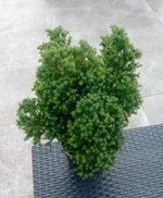
IMG_20210222_183126 (1).jpg

It was my third tree, and I was a 3 months rookie. I had seen some videos on youtube on how to begin with a tree, So I trimmed roots (thinking I was killing the tree), chopped the first and second big branches and repotted into akadama. A very bold move, since it was January and it was the first time I was repotting a tree . But fortune smiles sometimes to ignorance, and everything went right....
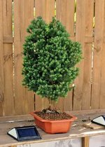
IMG_20210317_104145 (2).jpg

I knew I had to give it a design, but I was still very confused about what to do. So, for a year I was watching the tree and trying to figure out wich general design I wanted.
After a new repotting, I came up with this design last summer:
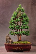
JMK_0960.jpg

After a year of uncontrolled growing, I prunned and cleaned in june trying to keep the design:
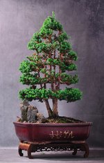
JMK_1925.jpg

What I like about this tree design are those vertical trunks and what I am questioning are those horizontal and parallel pads. So I'm thinking if I should break those first horizontal pads into more informal and different height little pads (as in the top third), or I should mimic the actual bottom third and create parallel pads for the rest of the tree.
In this second case the main vertical trunks should still be visible, but I fear the design should not be too natural.

What do you think?.....What would you change?
 
Since there is one tree (though two trunks/leaders from the base) I like the idea of maintaining a single apex. Whether the overall apex begins near the bottom of the tree or in the top 2/3 of the tree is your decision. If keeping the single apex look from the base, then some finer detail work to the ascending pads would help (foliage pruning to separate the pads/layers).

Otherwise, you also have the freedom to uncover the bifurcations (junctions where trunks divide: 1 becomes 2, 3) and expose what the first pad covers/hides. You can allow individual branches to be visible and angle them down as if it were a forest line.

Having rocks/ boulders on the soil bed is fine, but the tallest rock intrudes into the apex of the tree and into the bottom pad. Separating them will set the tree apart from the rocks, which is what the tree needs. Excellent tree overall. I like a shallower bonsai pot since the current one (in depth) is equivalent to the space between soil surface and first branching/pad. Shallower pot will make the tree appear even taller.

Great work so far.
 
In addition to my reaction on Reddit (the two horizontal lines). Try to make the tree narrower and I agree with suggestion for a shallower pot, this should make the tree look bigger. in the latest version the trees seems to be moving left. If so the rocks could be positioned further left or on the right,
 

Attachments

  • IMG_6022.jpeg
    IMG_6022.jpeg
    67.2 KB · Views: 29
Since there is one tree (though two trunks/leaders from the base) I like the idea of maintaining a single apex. Whether the overall apex begins near the bottom of the tree or in the top 2/3 of the tree is your decision. If keeping the single apex look from the base, then some finer detail work to the ascending pads would help (foliage pruning to separate the pads/layers).

Otherwise, you also have the freedom to uncover the bifurcations (junctions where trunks divide: 1 becomes 2, 3) and expose what the first pad covers/hides. You can allow individual branches to be visible and angle them down as if it were a forest line.

Having rocks/ boulders on the soil bed is fine, but the tallest rock intrudes into the apex of the tree and into the bottom pad. Separating them will set the tree apart from the rocks, which is what the tree needs. Excellent tree overall. I like a shallower bonsai pot since the current one (in depth) is equivalent to the space between soil surface and first branching/pad. Shallower pot will make the tree appear even taller.

Great work so far.
Thanks!. I agree about a shallower pot, but this tree will be the main in a planned forest slab for next year (adding 8-15 more of these trees, in fact they are all cuttings from this).
In addition to my reaction on Reddit (the two horizontal lines). Try to make the tree narrower and I agree with suggestion for a shallower pot, this should make the tree look bigger. in the latest version the trees seems to be moving left. If so the rocks could be positioned further left or on the right,
So you were that one on reddit!. You noticed quickly what I have been thinking for the last year!

Its a nice tree. What youre proposing might make it appear more natural. A little bit of variation, maybe some asymmetry
Thanks Bobby! Yeah, variation and asymmetry!!
 
Great design work for a first tree.
My vote is to break up the horizontal pads.
That idea to make space between rock and foliage is good too. Maybe by removing the branch on that side of the tree which will also break the horizontal lower pad.

Also consider the tips of minor trunks. These would normally turn and grow outward away from the shade of the main taller trunk. The upper ends of minor trunks effectively become branch pads near the top of the tree.
 
Nice tree - and great progress! To me I feel like the tree needs to lean into one style. Right now it seems like it's got a mix of some naturalistic elements, some formal upright structure, and even a little bit of penjing/topiary action happening.

I think you need to decide which route fits the tree the best for you and go all in. This tree could fit in all of those categories. Replicate a tree in nature and open up the canopy, build in more natural looking deadwood, etc.

Or...make very formal upright, with alternating pads to create a rigid but tranquil image. Right now I think it's half way in between.
 
Back
Top Bottom